
IŌĆÖm on the record as a huge fan of WordPress. IŌĆÖm a fan of the community, the software and everyone who contributes to make it better and safer. I help organise the WordPress Melbourne monthly meetups, you can hear me talk at WordCamps, meetups and even colleges, and you can download my themes and plugins in the official WordPress Theme and Plugin Directories. Having said that, I will say that I donŌĆÖt love every single thing about WordPress and if you know me at all, youŌĆÖll know that one of those things is the WordPress Customizer. IŌĆÖve even been known to say I loathe the Customizer. I really feel like it provides a horrible user experience.
In recent times two fairly big decisions have been made that affects how the Customizer will be used going forward. First, it was decided that it will be mandatory for all Theme Options to be built into the Customizer. This rule comes into effect in October (2015), 6 months from when that decision was made. The second proposal, which has caused a further stir, is one that proposes to merge the Menu Customizer Feature Plugin into Core. Along with this, was a discussion of also removing the existing menu screens.
Customizer for .ORG Theme Options
Let me touch on that first point briefly and just to clarify, it was only made mandatory for themes that are in the official WordPress.org Theme Directory.
I can totally understand why the decision was made, but that doesnŌĆÖt mean that I have to agree with it. The main reason it was made was to standardise the way in which theme options are displayed within the themes. The benefits are that it will provide a consistent user interface for people using .org themes and it will mean that the Theme Review Team (TRT) wont have to learn dozens of completely different theme option interfaces when reviewing the themes. Those are two really good reasons and I can totally get behind that decision. With that said though, I think the Customizer in its current form, is a horrible interface, and certainly not one that should be made as ŌĆ£standardŌĆØ. At least, just not yet. DonŌĆÖt get me wrong, IŌĆÖm all for creating standards and making things consistent across the WordPress platform. ThereŌĆÖs nothing more annoying than working on a theme and finding that it has a completely different look ŌĆśn feel to the standard WordPress UI. I just donŌĆÖt think the Customizer is the solution to this issue as it is currently.
Merging the Menu Customizer
Now, onto the main reason for this post and the second point I mentioned above. There is a WordPress Core Feature Plugin called the Menu Customizer. The Menu Customizer plugin adds custom menu management to the existing WordPress Customizer. As mentioned briefly above, the proposal (which looks set to go ahead at this time) is to merge this code into the WordPress core.
I think this is a terrible idea. One of the original selling points of the Customizer was that it would make it easier to customise the look ŌĆśn feel of your site as it included a ŌĆśLive PreviewŌĆÖ so that you could see your changes happen as you make them. In theory, this sounds great, but the reality and execution is really poor.
Adding menus into the Customizer provides no benefit over the existing Menus screen. What it does do though is cram the functionality into the very limited space that the Customizer utilises (currently 300px). As well as making it more difficult to create your menus, thereŌĆÖs no benefit to having a live preview for this.
A community divided
IŌĆÖm not the only one voicing concerns about these latest changes either. ThereŌĆÖs lots of other people who are also questioning the decision. ThereŌĆÖs been a couple of different posts on WP Tavern. Chris Lema and Carl Hancock, both well known within the WordPress community, have voiced their disapproval of the change. ThereŌĆÖs dozens of people who have commented on the Make WordPress blog post regarding the proposal to merge the Menu Customizer. Even Jen Mylo, made her feelings on the subject known. ThereŌĆÖs been several posts with hundreds of comments in the Advanced WordPress Facebook Group and you only have to do a quick search on Twitter to see countless others who are annoyed about this change. Yet all this is apparently being ignored by the core development team as they are still pushing for the change to be merged. *sigh*
Issues with the existing Customizer
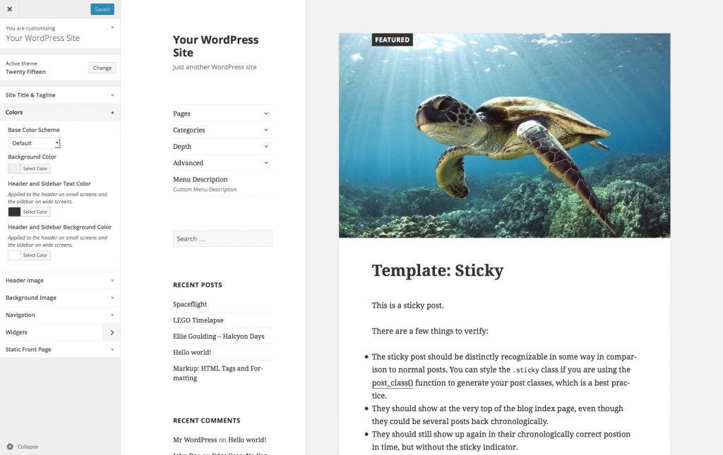
I have a number of issues with the existing Customizer in general. My main issue with the existing implementation is the size. Everything is crammed into a tiny 300px column. In fact, youŌĆÖve actually only got 275px when you allow for the padding on either side of this column. On my 27ŌĆ│ desktop monitor, itŌĆÖs ridiculous that everything is crammed into a space less than the size of an average smartphone. Now of course, not everyone uses a nice big 27ŌĆ│ monitor, but over 80% of the internet uses a screen size greater than 1024px and even at that small size, 300px is still ridiculously small. ItŌĆÖs not even a third of the screen width!
Since the Customizer column is so narrow, you end up with one long column of options as every option field takes at a very minimum, about 2.5 lines. ThereŌĆÖs the field label on one line, the field itself on another and then the margin below the field. The screenshot below is the Customizer for the default TwentyFifteen theme.
Inconsistencies galore
Another issue I have is the Customizer UI. ItŌĆÖs completely inconsistent with the rest of the WordPress user interface. Nowhere else in the WordPress Dashboard do you get multiple levels of panels sliding in and out of focus, or panels sliding in and out of view┬Ā to display extra options. (Some people might argue that the Distraction Free Writing button on the Page/Post Editor screen uses sliding panels. I see this as different as they simply slide to clear the screen. You donŌĆÖt actually interact with them)
Consistency is one of the most powerful usability principles: when things always behave the same, users donŌĆÖt have to worry about what will happen. Instead, they know what will happen based on earlier experience.
ŌĆö Jakob Nielsen
Even within the Customizer itself, there are inconsistencies. Sometimes you click a button and more fields appear below it. Other times you click a button and a panel slides in and out of view. Sometimes when you click a button, the panel slides to the left, other times it slides to the right (as in the theme changer). As leading usability expert Jakob Nielson says, ŌĆ£Users should not have to wonder whether different words, situations, or actions mean the same thing. Follow platform conventions.ŌĆØ
Now, IŌĆÖm not against making UI changes. If WordPress wants to stay ahead of competition like Squarespace, then they need to keep innovating and improving the user experience. If youŌĆÖre going to change the UI though, perform a complete redesign of the whole Dashboard. DonŌĆÖt simply change one small section so that itŌĆÖs completely different from everything else! Not only does it make it difficult for end users, it makes the whole interface clunky and less cohesive.
ItŌĆÖs making things harder, not easier
The existing Customizer is confusing. As someone who deals with end users on a daily basis, I can tell you they think itŌĆÖs confusing. IŌĆÖm a developer, I consider myself fairly smart, and even I think itŌĆÖs confusing. The existing Menus screen has been around for thirteen major WordPress revisions (since WordPress 3.0). People are comfortable with it now.
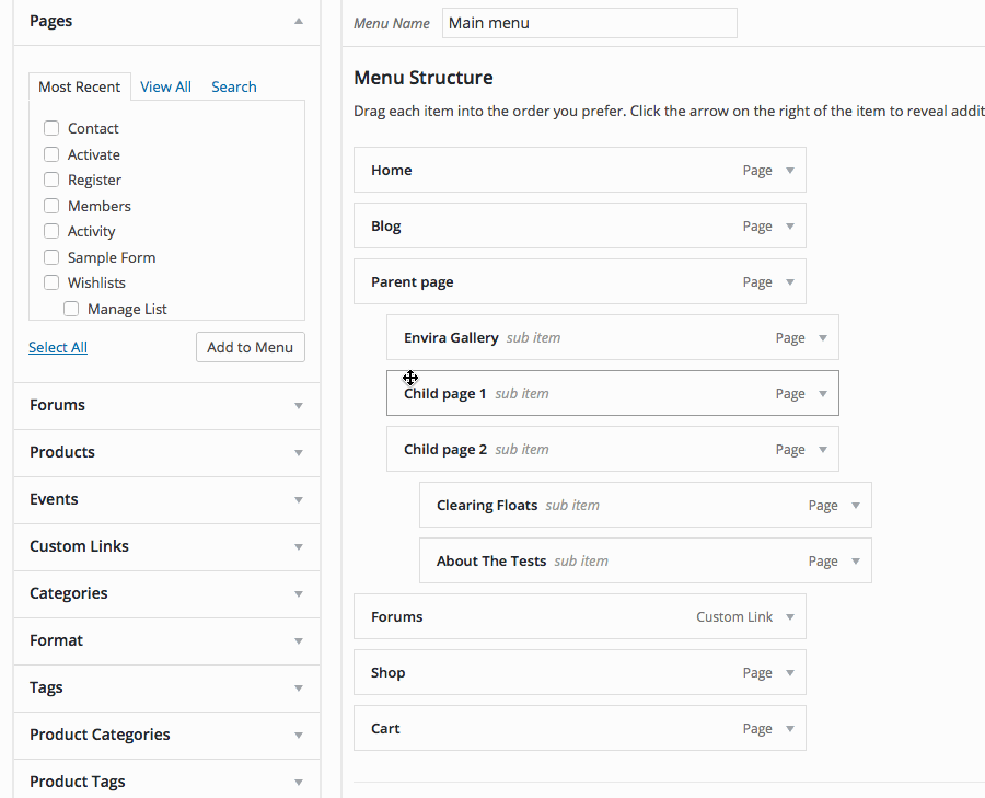
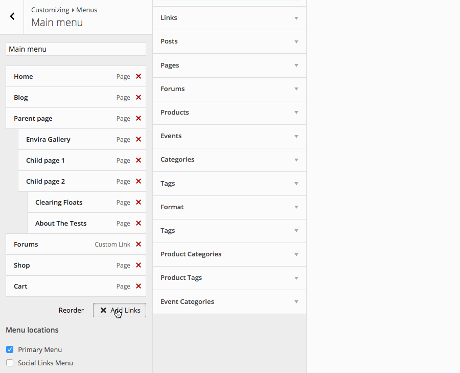
The new Menu Customizer is considerably more confusing to use. Adding Pages, Posts and other content & links to the menu is more confusing in the new Menu Customizer. Even the drag ŌĆśn drop functionality to rearrange the menu items doesnŌĆÖt give you the same useful feedback as to where the menu is being placed, like the current interface does.
This is the drag ŌĆśn drop feature in the existing menu system. See how it clearly shows where each item is being dropped.
This is the drag ŌĆśn drop feature in the new Menu Customizer. Notice how it doesnŌĆÖt provide any indication where the menu is being dropped. If you add a new menu item (eg a Page), itŌĆÖs marked as ŌĆśAddedŌĆÖ. If you then remove it, itŌĆÖs still marked as ŌĆśAddedŌĆÖ. This makes it extremely confusing. When you drop a menu item into a new position, it also expands, which is really annoying when youŌĆÖre moving multiple menu items around. ItŌĆÖs also (currently) impossible to indent menu items when dropping them, which means you canŌĆÖt make submenus. When you drag a top-level menu item with submenus, it simply moves the top-level menu item, instead of moving the top-level and everything underneath it. ThereŌĆÖs also no option to enable the extra fields like Link Target, Link Relationship, Description and most importantly, CSS classes.
IŌĆÖm sure some of these issues will no doubt get addressed and fixed at some stage, but considering itŌĆÖs currently scheduled to merge into (4.3) core as at June 17, IŌĆÖm┬Ā concerned that they still havenŌĆÖt been addressed and that it leaves little to no time for testing prior to merging.
Slow to use
Using the Customizer is slow. ItŌĆÖs slow to navigate with multiple menu levels and all the sliding panels. ItŌĆÖs slow to update, such as when you add a menu item and itŌĆÖs slow to update the live preview. When you edit your widgets via the Customizer, you no longer get the nice drag ŌĆśn drop interface that the existing Widgets screen provides. Also, you can only update one sidebar at a time as you have edit each sidebar panel separately, unlike the existing screen where all the sidebars are shown on the same page and you can simply drag ŌĆśn drop widgets into any of them.
Poor Navigation
ItŌĆÖs widely considered bad design when you have navigation menus that are more than 2 levels deep. TheyŌĆÖre difficult to navigate, more confusing and content is generally more discoverable when itŌĆÖs not buried within deep hierarchies.
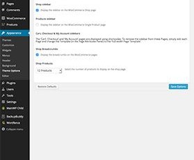
On a few of the recent posts about the Customizer a number of people have pointed to the Make theme by Theme Foundry as a good example of the Customizers implementation. I look at Make and see the exact opposite. I think itŌĆÖs a great example of why the Customizer doesnŌĆÖt work (in its current form).
Make has an extraordinarily large number of Customizer options.┬Ā There are literally dozens of different panels where you can find options. Navigating the Customizer options┬Ā for Make is a complete nightmare and trying to find specific options is incredibly difficult because there are so many different levels, up to four at certain times. Obviously, not all this is the Customizers fault. The number of theme options within a theme is completely up to the developer. What it does highlight though is that with this many options, which is not uncommon for a ŌĆśPremiumŌĆÖ theme, the Customizer is incredibly difficult to navigate. Since the Customizer panels are so narrow youŌĆÖll notice in the gif below that some of the Typography options scroll for pages and pages.
Because there are so many different levels each with a large number of options, navigating them all is time consuming and confusing. Just making the Customizer wider, would make navigating the Make theme options considerably less challenging.
My ideal Customizer
In my Quark theme that I have in the WordPress Theme Directory and with the themes I develop for clients, I use the┬Ā Options Framework by Devin Price. ItŌĆÖs incredibly easy to set up and implement and it seamlessly blends with WordPress since itŌĆÖs using the core Settings API. The following Theme Options screens are from Quark and you can see how perfectly it matches with the existing WordPress UI.
There are a couple of things that will no doubt immediately stand out with these particular Theme Options, when comparing to the existing Customizer. First up, thereŌĆÖs no Live Preview. This type of Theme Options layout doesnŌĆÖt really provide the layout for a Live Preview on the same screen. Personally though, thatŌĆÖs another reason why I like it. I would much rather see a preview of my site in a separate browser tab, where I can view the site exactly in exactly the same manner as a site visitor would see it, without any Customizer menus or panels covering up part of the page.
The other thing thatŌĆÖs immediately obvious is the large amount of screen real estate that youŌĆÖve got to play with.┬Ā Just look how everything is nicely spaced out, rather than squished into a tiny 275px panel. YouŌĆÖve got room to see the full URLs in edit fields and not to mention how much easier it is to display the Visual Editor controls and how much easier it makes for editing the content in those Editors.
If I had one WordPress wish, it would be for the Customizer to look more like this. Alas though, I know itŌĆÖll never happen as thereŌĆÖs been too much work put into the existing Customizer
Improving the Existing Customizer
Since I know the above option will never happen, the next best thing is improving the existing Customizer. It seems to me one of the best ways get people to embrace the Customizer more is for it to become more usable. So, the first thing that needs to happen is for it to increase in size.
IŌĆÖve create a few sample mockups based on a few of the screens in the Customizer as seen in the Make theme. I know these arenŌĆÖt perfect and IŌĆÖm sure that other people have lots of other good suggestions too. TheyŌĆÖre simply some suggestions to show how the existing Customizer could be improved to make better use of screen real estate. IŌĆÖve Included a copy of the original screen alongside each redesign so itŌĆÖs easier to compare them.
The first screen is simply the screen that appears once you open the Customizer. Since the idea is to improve the existing interface, rather than a complete redesign, IŌĆÖm suggesting to introduce an extra button at the bottom of the screen. The idea being that you can keep the Customizer as if, if thatŌĆÖs what you prefer, or you can ŌĆśdetachŌĆÖ it so that it floats over the live preview.

- Existing Customizer panel
- Redesigned Customizer panel
After clicking Detach, the Customizer would increase in size and float over the top of the live preview, rather than displaying as a small column on the left. In the screenshots below, the left is the original Customizer screen and on the right you can see it after itŌĆÖs been ŌĆśdetachedŌĆÖ and floating over the preview. Since this screen basically just shows a list of links to each of the various sections within the Customizer, thereŌĆÖs not much thatŌĆÖs changed.
- Existing Customizer panel
- Redesigned Customizer detached from left hand column
The next screen shows the Labels panel from the Make theme. IŌĆÖve opted to split the panel 50/50. One column for the label and any description (if needed) and the other column for the input fields. There is a fair bit of white space between the labels and the input fields so it may in fact be better to spilt the columns 30/70 instead, or even 40/60.
The reason behind the two columns, rather than simply stacking the label and input fields on top of each other is to decrease the page length. As you wouldŌĆÖve seen in one of my other gifs above, in some of the Customizer panels for Make, there are quite a few input fields which means quite a lot of scrolling. Putting the fields next to the labels rather than underneath would obviously help keep the page length down and therefore the amount of scrolling to a minimum. Even though IŌĆÖm not personally a fan of having hundreds of theme options, there are quite a few themes out there that do, and so this needs to be taken into account.
- Existing Customizer panel for Labels
- Redesigned Customizer panel for Labels
The final screen is the Text Headers panel from the Make theme. This is a better example of one of those panels where there is quite a significant amount of scrolling. Again, since IŌĆÖve split the panel into two columns, this would significantly reduce the amount of scrolling required. (On a side note, I also redesigned one of their controls. YouŌĆÖll notice the small grey squares. These are supposed to be a type of slider to increase/decrease the value in the input field. TheyŌĆÖre obviously not displaying properly though.┬Ā I redesigned them to have a simpler ŌĆś-/+ŌĆÖ control. The added benefit is that it would also make the control shorter so it would fit in the column better)
- Existing Customizer panel for Text Headers
- Redesigned Customizer panel for Text Headers
Conclusion
If youŌĆÖve managed to read all the way down to this point I think itŌĆÖs pretty clear what my thoughts on the Customizer are. ThereŌĆÖs definitely a need for developers to be able to add theme options into their themes as well as a standard interface for people to update & customise their theme. Having this sort of functionality built into core will mean thereŌĆÖs less need for developers to create their own (and quite often, different looking) options screens. I just donŌĆÖt think the existing Customizer is the answer. Just yet anyway.
Rather than rushing to move existing functionality into a Customizer that it appears a lot of people find challenging to use, how about we actually improve whatŌĆÖs there currently. LetŌĆÖs make it into something that people can actually get behind and are happy to use and will be happier to build for.
As mentioned briefly above, itŌĆÖs currently scheduled to merge the Menu Customizer into the 4.3 core on June 17. As of this post, thatŌĆÖs two days away. IŌĆÖm concerned that there is still so much functionality that is missing and/or not working properly. Even if itŌĆÖs added before the 17th, that leaves no time for proper testing. This goes completely against the whole idea behind the Features as Plugins model. To quote from the Core Handbook itself, ŌĆ£This model allows a feature to be built, tested, refined, and polished before it is considered as a merge candidateŌĆØ. I think the important things here are ŌĆ£tested, refined, and polishedŌĆØ. On that criteria alone, the Menu Customizer doesnŌĆÖt qualify. At least not yet. If you want to get this thing into core, then make sure that everything is working first and that it has, at the very minimum, the same functionality as the existing Menus page, as well as allowing time for proper testing. DonŌĆÖt put it into core and then fix things, get everything fixed first and then merge.
Do you have an opinion on the Menu Customizer or the Customizer in general? IŌĆÖd love to hear your thoughts in the comments below.